


A scroll-stopping social media design isn’t just a pretty post — it’s a visual strategy that fuels your content’s visibility, saves, shares, and brand recognition.
Here’s why strong design matters for social media performance:
- Higher Engagement Rates: Whether it’s a carousel, story, or static post, well-designed graphics get more likes, comments, and saves. This signals to the platform that your content is worth promoting — helping you reach a wider audience organically.
- Improved Brand Recognition: When your visual style is cohesive across posts, followers begin to recognize your content instantly. That consistency builds trust and loyalty — key ingredients for long-term community growth.
- More Shares and Saves: Posts that are educational, inspirational, or beautifully styled are far more likely to be saved and shared. This extends your content’s lifespan beyond the initial post and boosts visibility across networks.
- SEO for Social Search: Platforms like Pinterest, Instagram, and even TikTok are now used as search engines. Having visually clear and relevant content (with proper text and design balance) helps your posts show up in topic searches.
Design Tip: Always align your social media design with your brand voice and content goals. Use bold titles, clean visuals, and subtle logo placement to stay recognizable without being repetitive. When done well, social content doesn’t just “look good” — it builds real traction.
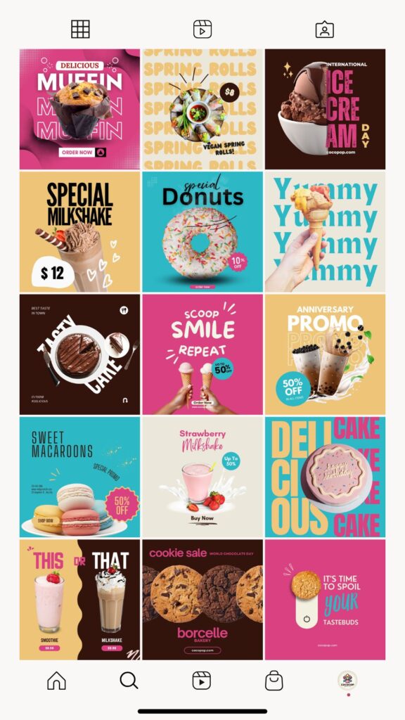
Take a look at the kinds of designs I created for Instagram:
✔️ They’re consistently branded
✔️ They reflect the topic or message at a glance
✔️ They’re designed to catch attention in fast-moving feeds
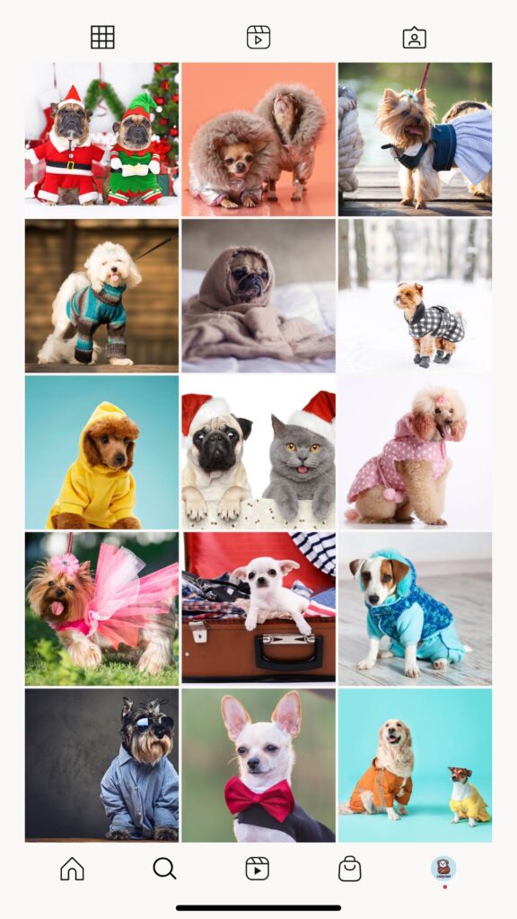
Before / After
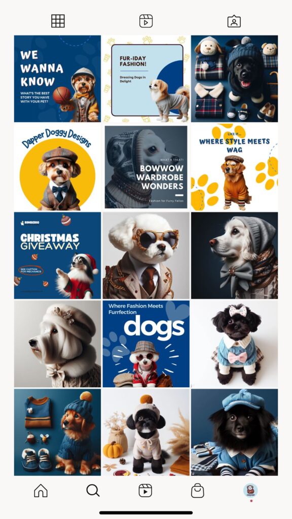
Before / After

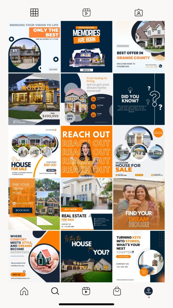
Before / After
Social Media Design Case Study
Social media isn’t just a place for updates — it’s a digital storefront. And in a space where content moves fast, design is what makes people pause, remember, and engage. This case study showcases how I redesigned several brand feeds to create cohesive, branded, and visually powerful social experiences that drive interaction and trust.
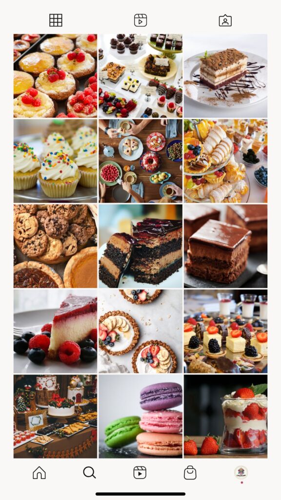
In the before visuals, we see a mix of uncoordinated content — a variety of themes, inconsistent color palettes, and no strong visual identity. While the images were informative, they lacked cohesion, making the feed feel busy and less memorable. Audiences scrolling through may miss key messages, and brands lose out on the trust that comes with a polished presence.
Now look at the after visuals. I introduced structured templates, unified typography, consistent brand colors, and a blend of lifestyle and promotional posts. Whether the brand is in real estate, pet fashion, or bakery promotions, each design was tailored to match its tone, market, and message. The result? A feed that’s easier to follow, more engaging to explore, and more likely to convert followers into loyal customers.