


A great infographic isn’t just a visual — it’s a powerful tool for simplifying complexity, enhancing content engagement, and driving SEO performance.
Here’s why infographics matter in digital strategy:
- Better Information Retention: People remember 80% of what they see, compared to just 20% of what they read. Infographics combine both — delivering insight visually for longer-lasting impact.
- Higher Engagement: Visual content consistently outperforms plain text. Infographics grab attention quickly and encourage users to pause, scroll, and understand. This increases time spent on page — a win for SEO.
- Increased Shareability: Infographics are highly shareable across blogs, landing pages, and social platforms — increasing referral traffic and earning valuable backlinks that improve website SEO.
- Enhanced Search Visibility: When embedded properly with alt text and keyword-rich captions, infographics contribute to on-page SEO — helping blogs, guides, and landing pages rank higher in search results.
- Stronger Brand Authority: Custom infographics allow brands to position themselves as educators and thought leaders. They’re ideal for tutorials, how-to’s, research summaries, comparisons, and industry stats.
Design Tip: A good infographic balances structure and creativity. Use consistent fonts, colors, and icons — but let the story lead the design. Always design with both your audience and search engines in mind.
Take a look at effective infographics:
✔️ They break down complex topics into digestible visuals
✔️ They align with the content theme or data source
✔️ They’re easy to scan, save, and share — making them SEO gold


Infographic Case Study
When it comes to explaining a process, summarizing key data, or presenting a comparison — few tools are more effective than infographics. In this case study, I showcase how I transformed content-heavy topics into clean, scannable, and high-converting visual assets for clients in different industries.
One example features a piece designed for SkyGuard Roofing titled “Roof Repair vs. Roof Replacement.” The client needed to explain the differences between two services — a common point of confusion for homeowners — while still keeping the message easy to digest. I developed a three-column layout with friendly illustrations, concise breakdowns, and clear headings. The result was a professional yet approachable visual that simplified a complex decision, helping both SEO and conversion.
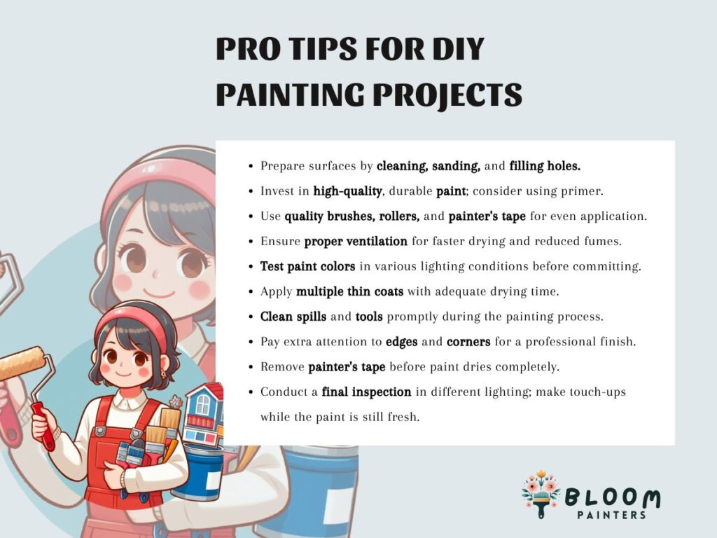
Another standout project is “Pro Tips for DIY Painting Projects” created for Bloom Painters. This client wanted a listicle-style graphic that could perform well on Pinterest, Instagram, and blogs. I used character illustrations, brand-aligned colors, and bold typographic highlights to create a checklist that educates without overwhelming. Viewers could quickly absorb the tips or screenshot the entire guide — making it both functional and shareable.
These visuals weren’t just designed to “look good” — they were created to drive results. The SkyGuard piece led to increased service inquiries thanks to higher time-on-page, and the Bloom infographic was shared across multiple Pinterest boards, leading to new followers and stronger blog traffic.
Infographics like these are incredibly versatile. They support blog content, enrich social feeds, and work well in email campaigns or print materials. Most importantly, they make your brand look polished, professional, and informed.